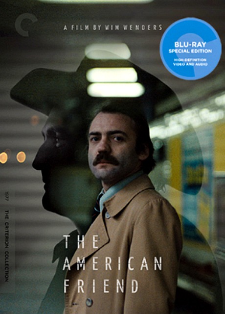
Criterion’s Bluray of Wim Wenders‘ The American Friend (’77), which was announced today, will be presented within a 1.66:1 aspect ratio, which is how it was projected at the New York Film Festival a little more than 38 years ago. The American Friend “is one of those films that I wanted to literally move into,” I wrote last year. The gloomy Hamburg realm was, at the time, a reflection of my own personal weltschmerz and vice versa. It inspired me to pitch a column to a couple of publications called ‘Hollywood Weltschmerz.’ I was (and perhaps on level I still am) Dennis Hopper taking polaroid photos of himself while lying on a pool table. In late ’77 or early ’78 I tried to figure a way to paste my face onto Bruno Ganz‘s in that famous poster, but I couldn’t get it right.”
There’s a five-minute visual essay on Criterion’s new On The Waterfront Bluray called “On The Aspect Ratio.” It explains why Criterion went with three aspect ratios — 1.66 (the preferred default version), 1.33 and 1.85. Here’s the narration. I’m warning the 1.85 fascists right now that they won’t like it. This is the end of the influence of this rogue cabal. Henceforth the 1.66-ers and the “boxy is beautiful” gang will have the upper hand.
Update: Some of the commenters are shrugging and saying, “Uhh, so these Columbia films were framed for 1.85 but protected for 1.33…so what?” The “so what” is that the Criterion guys, the ultimate, high-end purist dweebs of the digital home-video realm, explain in this essay why they chose 1.66 as their default a.r., and how severely and pointlessly cropped 1.85 is and how open and accepting and all-encompassing 1.33 is. The essay basically says “if you have any taste at all or have any regard for aesthetic elegance and balance, it’s obvious that 1.66 or 1.33 is the way to go. You’d have to be a troglodyte to prefer 1.85.”
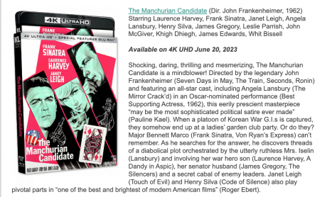
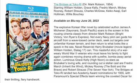
This morning Kino Lorber announced a new Bluray of Mark Robson‘s The Bridges at Toko Ri (’54); ditto a forthcoming 4K Bluray of John Frankenheimer‘s The Manchurian Candidate (’62). I immediately wrote KL’s Frank Tarzi, who became a true HE hero nine years ago after releasing a boxy (1.37:1) Bluray of Delbert Mann‘s Marty, and asked him what the aspect ratios would be.
Tarzi’s reply broke my heart.
Despite a wonderfully boxy, extremely handsome version of Toko Ri having streamed on Vudu for several years, Kino Lorber’s forthcoming Bluray will be presented at the dreaded 1.85. Hearing this was like getting stabbed in the chest with a ballpoint pen. As one who greatly respected Tarzi’s decision to release that boxy Marty Bluray, I was naturally hoping that KL’s Toko Ri Bluray would be issued at 1.37 or at the very least 1.66. Aaagghh!
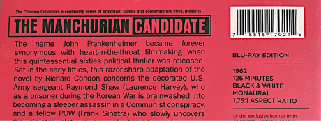
The Manchurian Candidate was mastered at 1.66 for many years, and then, for no reason whatsoever, was slightly cleavered down to 1.75:1 by Criterion when they issued their Bluray in late 2015.
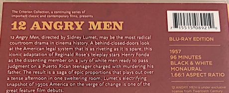
Tarzi: “KL’s Bridges at Toko Ri, The Manchurian Candidate, 12 Angry Men and Night of the Hunter are all presented at 1.85:1. That’s how they played in theaters. We have the needed documentations for all.
“Kino’s Marty re-release (’22) included both 1.37 and 1.85 versions.
“As far as Juggernaut is concerned, the master is the same 1.85 master we had previously released. The packaging had said 1.66, but that was a typo. It’s the same transfer but encoded at a higher bit rate and on a dual-layered BD50 disc, giving the feature 30mbps or more. So it should look better than the previous release that was on a BD25 single layered disc. We also added a TV Spot.”
HE reply: “Frank, you’ve broken my heart. 12 Angry Men was shown at 1.85 in theatres on ‘57, you say? So the Criterion guys who cropped it at 1.66 are improvising or irresponsible?
“Manchurian began its home video life with a 1.66:1 aspect ratio. Then Criterion whacked it down to 1.75. Now Kino has chopped it down further to 1.85. Terrific.
“Toko Ri is drop-dead beautiful at 1.37. You’ve decided to eliminate…what, 30% or 35% of that 1.37 image?
“What can I say, Frank? I thought you were a bro, at least as far as that 1.37 Marty Bluray was concerned. Now, it appears, you’ve gone over to the dark side. You’ve apparently been Bob Furmanek’ed.
“It really doesn’t matter what aspect ratio panicked theatrical distributors went with in 1954 or ‘57. All that matters is how good and true the film looks by today’s whatever-works standard. We can choose any aspect ratio that seems right and pleasing to our eyes, as you did with Marty.
“It is my conviction that Bob Furmanek is a sworn enemy of HE’s concept of pictorial big-screen beauty. He only cares about what distribs we’re scared of…about uncovering historical documentation that shows they were projecting with 1.85 aperture plates.
“Loyal Griggs’ Toko Ri cinematography was clearly framed or protected for 1.37. Paramount was a 1.66:1 studio in ‘54, as you know. If you had to whack it down, you could have at least held yourself to 1.66. But cropping it to 1.85 is unconscionable.”
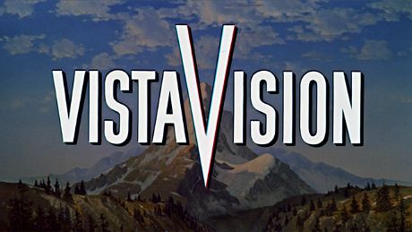
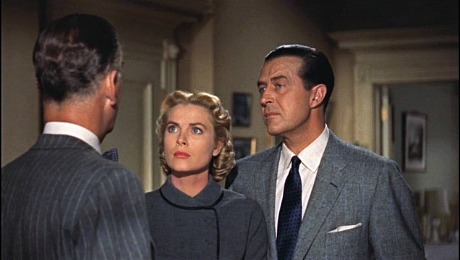
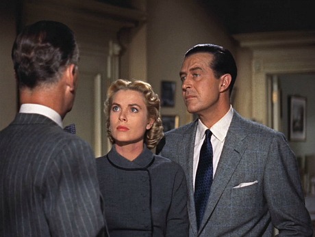
The VistaVision fanfare image on top is composed at 1.85…no problem. The clip below is/was composed at 1.66 in 1954. The clip below that (third down) is composed at 1.85. The three static images at the bottom [after the jump] are, in this order, 1.42 (call it 1.37), 1.66 and 1.75. A 1.85 VistaVision fascist sees only the top and third-placed image and rejects the rest as heresy. I am merely suggesting that the second from the last image is more pleasing to the eye, and that the last image is the second most pleasing….that’s all.
1.85:1
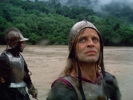
There is no joy in 1.85 Mudville this morning with DVD Beaver having posted 1.33:1 screen captures from the upcoming BFI Bluray of Werner Herzog‘s Aguirre, The Wrath of God (’77). Herzog’s dp Thomas Mauch obviously framed each shot to allow for 1.66 or 1.85 cleavering, but the fact that Herzog and the producers of this Bluray decided to go full boxy is one more stone in the shoes of 1.85 fascists. Their pain is my gain. This film and Fitzcarraldo and My Best Fiend are among my all-time Herzog favorites. Furies in the jungle, metal helmets, blonde against green, howled obscenities, etc.
I’ve watched Mark Robson‘s The Bridges at Toko-Ri (’54) four or five times since the mid ’90s. I’m a fan for several reasons but one of the biggest is Loyal Griggs‘ richly Technicolored, perfectly lighted cinematography. But I’d never seen it in high-def until renting it last night on Vudu, and lo and behold this December 1954 release hasn’t been whacked down to 1.66 or 1.85, as per custom when ’50s films get remastered for high-def or Bluray presentation. Boxy is beautiful on its own terms, of course, but 1.37 renderings of high-def, sharply focused 1950s Technicolor…heaven.
William Holden as Lt. Harry Brubaker in Mark Robson’s The Bridges at Toko-Ri, a Paramount release that opened in December 1954.
Toko-Ri‘s lustrous, high-end appearance suggests it was shot in VistaVision, but it was captured in straight 35mm. It was clearly framed to protect a 1.37 aspect ratio with allowances for possible theatrical matting to 1.66, the aspect ratio that its distributor, Paramount Pictures, had been endorsing at the time. The studio was actually in the throes of changing over from 1.66 to 1.85 aspect ratios in December ’54. (Its first 1.66:1 VistaVision release, White Christmas, opened in January ’54.) Should this film ever appear on Bluray (which doesn’t seem especially likely), this history could be used by the 1.85 fascists to justify cleavering The Bridges at Toko-Ri down to 1.85 or at least 1.66.
Yes, Virginia — during the first few years of the 21st Century there really was a thing called 1.85 fascism. For a while there it seemed as if non-Scope movies of the ’50s and early ’60s were going to be compressed and trapped inside severe 1.85 to 1 rectangles. But that scenario is finished now, and the fascists, while not fully discredited, will never have the same authority again. Sincere thanks to the Criterion Co. for cutting them off at the knees and particularly to this five-minute essay, produced and edited by Issa Clubb.
On 2.4.13 I ran an audio clip of this essay as part of a piece “Despair Time for 1.85 Fascists“:
“There’s a five-minute visual essay on Criterion’s new On The Waterfront Bluray called ‘On The Aspect Ratio.’ It explains why Criterion went with three aspect ratios — 1.66 (the preferred default version), 1.33 and 1.85. Here‘s the narration. I’m warning the 1.85 fascists right now that they won’t like it. This is the end of the influence of this rogue cabal. Henceforth the 1.66-ers and the ‘boxy is beautiful’ gang will have the upper hand.
“Update: Some of the commenters are shrugging and saying, ‘Uhh, so these Columbia films were framed for 1.85 but protected for 1.33…so what?’ The “so what” is that the Criterion guys, the ultimate, high-end purist dweebs of the digital home-video realm, explain in this essay why they chose 1.66 as their default a.r., and how severely and pointlessly cropped 1.85 is and how open and accepting and all-encompassing 1.33 is. The essay basically says ‘if you have any taste at all or have any regard for aesthetic elegance and balance, it’s obvious that 1.66 or 1.33 is the way to go. You’d have to be a troglodyte to prefer 1.85.'”
I just watched the Fox Home Video Bluray of Gentlemen Prefer Blondes, and it’s absolutely beautiful, scrumptious, dazzling. A breathtaking Technicolor high. Watching it is like eating an ice cream sundae with whipped cream and a cherry. On top of which it’s been mastered at a 1.37 aspect ratio…heavens!
Jane Russell, Marilyn Monroe in Gentlemen Prefer Blondes.
In going with 1.37 Fox Home Video’s Schawn Belston has delivered a gentle reminder to the Bluray community that 20th Century Fox wasn’t part of the 1.85 aspect ratio mandate that swept across Hollywood in the spring of ’53. 1.85 fascist theology says that all films released after April 1953 were projected at 1.85…nope!
This may sound anecdotal to some, but to me the 1.37 presentation of Gentlemen Prefer Blondes, which originally opened in July 1953, is a slight crack in the dike.
Projectionist #1 at New York’s Roxy (on or about July 12, 1953): Here are the prints for that new picture, Gentleman Prefer Blondes. We can run it after the show tonight.
Projectionist #2: With what aperture plate?
Projectionist #1: You ask? 1.85, of course. That’s the new rule, what the boss wants.
Projectionist #2: Wrong. We’re showing it at 1.37.
Projectionist #1: Whaddaya mean? Everything is supposed to be shown at 1.85. The rule came down three or four months ago. S’matter with you?
Projectionist #2: It’s wrong, I tell ya. I’ve heard this one has to be shown at 1.37. Fox films are a different deal than ones from Columbia and Warner Bros. and Paramount.
Projectionist #1: Except Paramount wants 1.66.
Projectionist #2: And that’s not all. When From Here To Eternity opens next month we’re not showing that in 1.85 either. That’ll also be shown at 1.37.
Projectionist #1: But that’s Columbia!
Projectionsist #2: Whatever. We’re showing it at 1.37.
Projectionist #1: How’s anyone supposed to keep this shit straight?
“I’ve never found any evidence in [Fox’s] studio files of a ‘1:85 starts at midnight’ dictum,” Belston told me this morning. “There is plenty of documentation, as you probably know, about Fox from 1954 on making every movie possible in CinemaScope. Ditto the development of stereo and CinemaScope55 later.
“I can tell you from looking at the non-Scope Fox films of 1953 (Call Me Madam, Niagara, Inferno and Pickup on South Street come to mind particularly) that they look more correctly framed in 1.37 than in 1.85, in my opinion. Additionally, whenever these films have screened within the last decade, projectionists/archives/museums have always shown them as you might expect in a 1.33/1.37 aspect ratio.
“Neither of these points is proof of how they should be shown, but for whatever it is worth to you, I’m fairly certain most if not all academics would agree with the 1.37 approach.”
Alfred Hitchcock‘s Dial M For Murder may well have been composed so that 1.85 projections would look presentable, but that doesn’t mean that a 1.78 or 1.85 version will look better than the basic and very pleasing boxy proportion that people have been watching for decades.
I’ve been examining Dial M for Murder all my life at 1.33 or 1.37. I saw it in 1.33 or 1.37 3D at the Eighth Street Playhouse in the West Village in the early ’80s. And the compositions and framings were and are entirely satisfactory and didn’t need to have their tops and buttons CHOPPED OFF WITH A MEAT CLEAVER.
The 1.78 or 1.85 a.r. on the Dial M For Murder Bluray was favored because of one reason only — because this a.r. conforms to the 16 x 9 aspect ratio of high-def flat panels. The people who made this call were nothing but a FASCIST REVISIONIST GANG.
“We have a vision,” their manifesto reads. ‘A vision of all films shot from the early ’50s to mid ’60s with their tops and bottoms CHOPPED OFF, and we will stop at nothing to achieve that goal. Because of 16 x 9 high-def screens, we are committed to killing visual information. And we will succeed because we have the factual data and research to back up the assertion that these films were shot to be shown at 1.85, but could also be shown at 1.33 or 1.37 for purist film buff screenings and for television airings and VHS and DVD versions.
“Repeat after us: WE HAVE A VISION, and it is about KILLING VISUAL INFORMATION by slicing off the tops and bottoms of films.”
These films look completely fine and have much more breathing space at 1.33 or 1.37 and in fact are VISUALLY PREFERRED this way by the Movie Godz and all good men of taste and conscience.
I feel like Gregory Peck‘s Captain Ahab at the end of Moby Dick: “Oh, damn thee, 1.85 aspect-ratio fascists! To the last I grapple with thee. From hell’s heart I stab at thee. For hate’s sake I spit my last breath at thee!”
If nothing else, the men and women of the Criterion Collection are known for adhering to purist principles in transferring older films to DVD and Bluray. Whatever and however a film in question looked to audiences when it first came out, this is how the Criterion team will present it — no ifs, ands or buts. But to go by information on a Criterion webpage for its forthcoming Bluray of Otto Preminger‘s Anatomy of a Murder (’59), the aspect-ratio brain police have wormed their way into Criterion and are imposing an Orwellian reassessment.
Frame capture from ColTriStar Home Video’s 11 year-old Anatomy of a Murder DVD
Frame capture supplied by Criterion Co. website page about its Anatomy of a Murder Bluray.
A movie that was very pleasingly and beautifully filmed with a protected aspect ratio of 1.33 to 1 — an aspect ratio which has been seen thousands of times on broadcast and cable TV, and which was presented on a 2000 Anatomy of a Murder DVD, and which the jacket copy for said disc proclaimed as “the original theatrical aspect ratio” — will be presented by Criterion next February with a 1.85 to 1 cropping.
In other words, Criterion is going to pull out its samurai blade and whack the living hell out of this film. I mean, that’s a lot of visual information being chopped out of the top and bottom of the frame. Despite those 1.33 framings being so visually pleasing, so elegant, so 1950s-looking, so boxy and fuddy-duddy, so “your grandfather’s living-room TV.”
But once again, as with Sony Home Video’s recent The Caine Mutiny Bluray, we’re going to see compositions on the Anatomy Bluray that feel sliced down and compressed and confined…like they’re in prison.
Except we were told a few weeks back that Sony’s restoration guy Grover Crisp cropped The Caine Mutiny Bluray down to1.85 because he’d reviewed the film’s original notes and logs about Edward Dmytryk‘s intended aspect ratio and that this was indeed the correct way to present it. (I still say “no” to this but that’s an earlier story.)
See the dog? You can see most of it. It’s almost a whole dog.
See the half-doggy? Do you GET IT NOW, fascists? Anyone who says that the half-doggy framing is better is in DEEP DENIAL and needs to be ignored or, better yet, slapped around.
Now, if Grover was technically correct in cropping Caine to 1.85 (and one assumes he based it on original notes and specifications, even though it was a highly questionable call from aesthetic perspective), how could Sony have approved or allowed jacket copy on the 2000 Anatomy DVD stating that 1.33 to 1 is “the original theatrical aspect ratio“?
What’s good for the goose should be good for the gander, no?
In other words, how and why could the Criterion people approve a 1.85 to 1 aspect ratio on their forthcoming Anatomy Bluray if the original aspect ratio (according to Sony Home Video) was 1.33 to 1?
The apparent answer is that Criterion is going with a 1.85 to 1 a.r. because they damn well feel like it. Because they’ve decided “to hell with it, this is what we’re going with and fuck off.” But either Sony was correct with its 1.33 proclamation in 2000 or Criterion is right about its forthcoming Bluray. They can’t both be right.
The answer, I believe, is the rule of simple expediency. A boxier aspect ratio worked fine with 1.37 to 1 analog TVs 11 years ago, but it doesn’t work with today’s 16 x 9 high-def flat screens. It seems to be that simple. I think it’s a flat-out travesty to whack Anatomy of a Murder down to 1.85, and I had the power and the influence I would lead a smelly unkempt mob into Criterion’s Manhattan headquarters, and we would refuse to leave until they re-think things and, knowing that the fascist mindset refuses to consider 1.33 any more, agree to at least crop it down to 1.66, which I would find more tolerable. Occupy Criterion!
Postscript: I’ve sent emails about this issue both to Sony’s Crisp and the Criterion people. But they both reside in very thick and deep concrete bunkers, so to speak, and they rarely discuss aspect ratio matters with press people. It is their refusal to come out in the sunlight and talk turkey, really, that gets me so angry about this stuff.
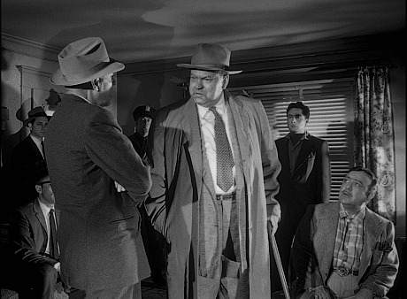
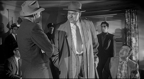
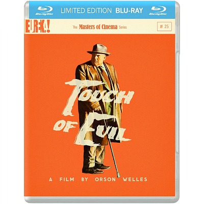
Obviously the Masters of Cinema guys who prepared the double-disc Bluray release of Orson Welles‘ Touch of Evil didn’t get the memo from the 16 x 9 fascists that all 1950s films have to masked at 1.85 or 1.78 to 1 because that was how they were shown from 1953 on.
Who needs the boxy headspace in this frame-capture of the 1.37 version of Touch of Evil, right? Whack it down, the fascists say. Put those actors in a 1.85 or 1.78 jail and keep them there!
In an act of stubborn, mystifying rebellion that will almost certainly infuriate the dictatorial 16 x 9 crowd in the U.S. and England, this Masters of Cinema release offers the 111-minute-long 1998 reconstruction of Touch of Evil in both 1.85:1 and 1:37 aspect ratios, and the 95-minute long 1958 theatrical version in both 1.85:1 and 1:37:1 aspect ratios.
I’m hereby inviting those who’ve been insisting in past discussions that 1.78 or 1.85 to 1 croppings are the only way to go with ’50s and ‘early to mid ’60s films (guys like Joe Gillis and C.C. Baxter and A Pop Calypso and BadHatHarry and lawnorder and, yes, the eminent Robert Harris) to write a letter of public scolding to the Masters of Cinema team.
These guys need to explain in detail how the MofC techies were wrong and misguided and perverse to offer 1.37 versions of this Orson Welles classic along with 1.85 versions. Because they were…right? I mean, who needs this boxy shit? Whatever possessed the MofC guys to even consider including 1.37 versions? Are they wise guys? Have they been reading our explanations on this site over the past few years that 1.78 or 1.85 croppings are the only way to go or haven’t they?
The only problem for me is that this Bluray is Region 2 only. I just received region-free British Blurays of the 1962 Cape Fear and West Side Story. Why can’t all British Blurays be region-free?
From DVD Beaver’s description: “Quite a phenomenal package from The Masters of Cinema. This is 2 dual-layered Blu-ray discs — the first has the 1 hour, 51-minute long 1998 reconstruction of Touch of Evil offered in both 1.85:1 and 1:37 aspect ratios. The widescreen version has a 2008 recorded optional commentary by the restoration producer, Rick Schmidlin.
“The full-frame version has the 1999 recorded optional commentary with Charlton Heston, Janet Leigh and Mr. Schmidlin. Sharing that disc are the two video extras; Bringing Evil to Life [21:00] and Evil Lost and Found [17:06] as well as a theatrical trailer (which includes alternate footage) — all three video extras in 480i.
“Disc 2 has the 1 hour-35-minute 1958 Theatrical version of Touch of Evil offered in both 1.85:1 and 1:37:1 aspect ratios. There is also the ‘Preview Version’ in widescreen. The Theatrical Versions offer an optional, duplicated, commentary by critic F. X. Feeney (2008) and the 1 hour-48-minute 1.85:1 ‘Preview Version’ has a commentary by Welles scholars James Naremore & Jonathan Rosenbaum (rated the BEST commentary of the Year HERE).
“All commentaries and digital extras are found on the 2008 50th Anniversary DVD from Universal. So we get the theatrical in the optional 1.37:1 and the image and audio in HD and a magnificent 56-page booklet featuring essays by Orson Welles, Fran√ßois Truffaut, Andr√© Bazin and Terry Comito; interview excerpts with Welles; a timeline of the film’s history; and extensive notes on the film’s versions and ratios.
- Really Nice Ride
To my great surprise and delight, Christy Hall‘s Daddio, which I was remiss in not seeing during last year’s Telluride...
More » - Live-Blogging “Bad Boys: Ride or Die”
7:45 pm: Okay, the initial light-hearted section (repartee, wedding, hospital, afterlife Joey Pants, healthy diet) was enjoyable, but Jesus, when...
More » - One of the Better Apes Franchise Flicks
It took me a full month to see Wes Ball and Josh Friedman‘s Kingdom of the Planet of the Apes...
More »
- The Pull of Exceptional History
The Kamala surge is, I believe, mainly about two things — (a) people feeling lit up or joyful about being...
More » - If I Was Costner, I’d Probably Throw In The Towel
Unless Part Two of Kevin Costner‘s Horizon (Warner Bros., 8.16) somehow improves upon the sluggish initial installment and delivers something...
More » - Delicious, Demonic Otto Gross
For me, A Dangerous Method (2011) is David Cronenberg‘s tastiest and wickedest film — intense, sexually upfront and occasionally arousing...
More »